We already know that the new Shopify one-page checkout performs better than the "old" multi-step one. In this guide, we'll focus on how to optimize the performance further and achieve a +60% conversion rate (calculated as entered checkouts vs. placed orders).
Before we start, it's important to realize the optimization space is now limited (you have only a single page), and every little detail counts. Also, always think mobile-first as mobile e-commerce accounts for 60% of all online sales.
Customizing Shopify checkout, in general, is somewhat limited unless you are on Shopify Plus, but there are still many things you can optimize. All tips in this guide are doable no matter what Shopify plan you are on, and you can implement all of them even on Shopify Basic.
This is by far my most favourite "hack". It's super easy to implement, but the impact on conversion rate can be significant.
By default, the Shopify one-page checkout is the "Pay now" label on the main call-to-action button. Using such a term associates the next action only with the payment and outgoing money from the customer's POV.
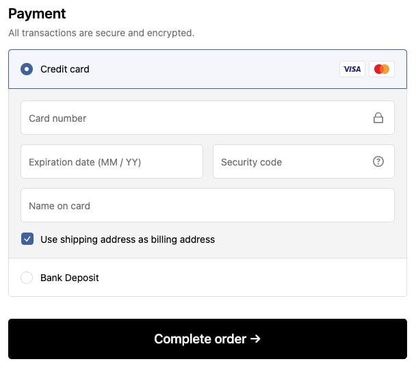
Instead, focus on the neutral/positive side and associate the label with receiving the desired product. I recommend using texts like:
- Complete order
- Confirm purchase
- Place your order
- Submit order
- Buy now
You can edit the wording by going to your store admin > Sales channels > Online store > Themes > three dots button on your live theme > Edit default theme content and searching for the "Pay now" label. Then you can change to anything you like.
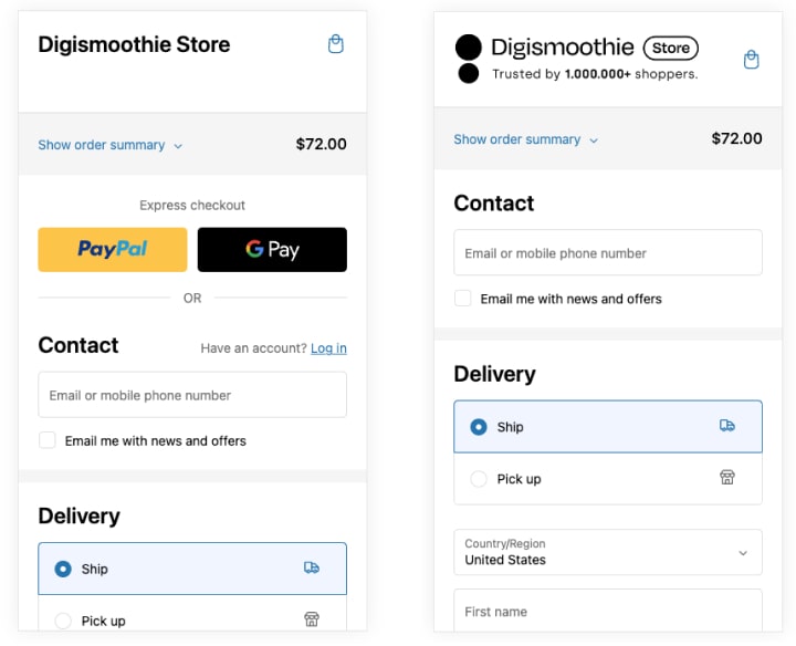
Displaying social proof at checkout is a good practice that leads to increased trust and conversion. However, it's quite difficult to do in the one-page checkout due to limited space.
Shopify offers the usage of header banner in recommended size 1000 x 400 px. The problem is the banner is unreadable on mobile and cut on desktop. A much better solution would be using a different banner for desktop and mobile.
So, instead of a banner, you need to be creative through the logo section. Shopify allows you to upload a custom logo to your checkout. You can adjust your logo and add a small note like "Trust by XX shoppers" or "Need help? Call XX". The note will be readable and look good both on mobile and desktop devices.
The fewer fields the customer has to fill in, the better. Think really carefully about every single one of them and use your past orders to analyze their usage.
Not sure whether you need a Company name? Look at your order history and see how many customers used it. If none or very few, feel free to remove it. Same with the Address line 2 (apartment, unit, etc.) field. Even keeping it optional can confuse some customers and make the checkout visually "longer."
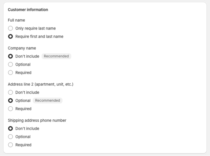
To edit the mandatory checkout fields go to your store admin > Settings > Checkout and find the section Customer information.
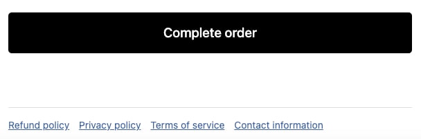
Your checkout needs to look trustworthy and compliant. Make sure to have all the policy documents loaded in your store. You can upload them by going to your store admin > Settings > Policies. They are automatically displayed in the footer of your checkout.
Entering the checkout process should feel like a native part of the purchase journey. It shouldn't look different. Otherwise, customers may lose trust and drop off.
In the case of Shopify's one-page checkout, it means using the same fonts, colors, logo, and messaging as on the storefront.
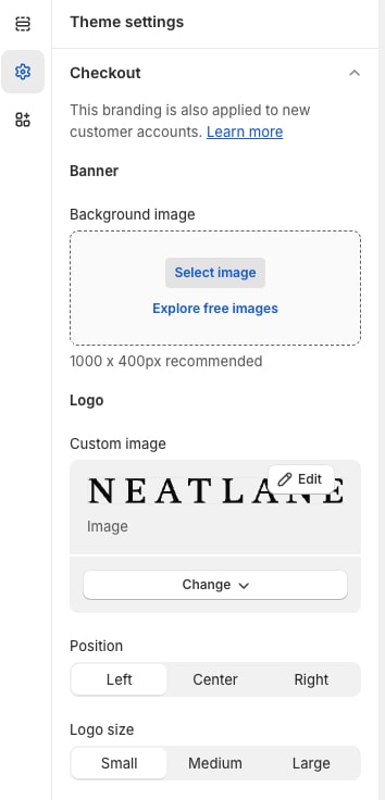
You can customize all these by going to your store admin > Online store > Themes > Customize > Theme settings (left menu) > Checkout.
Express checkout buttons like PayPal or Shop Pay can be great conversion boosters. However, if customers are not using them, they don't add any value and should be removed because they are in a very prominent position. Keep in mind their usage is depended on your customer's geography and your business segment. I definitely recommend reviewing your order data to understand how often are the express checkout buttons used.
For example, we are not using express checkouts in stores where customers are less experienced in e-commerce, or majority of customers are businesses.
You can enable/disable them by going to your store admin > Settings > Payments > Manage and disable Shop Pay and all wallets (Apple Pay, Google Pay, etc.).
If you are using Shopify Markets, you can also customize their usage per market, which is an ideal scenario (i.e., use them in North America).
In the new one-page checkout, the space is very limited and considering majority of shoppers are using mobile devices, every word counts. I recommended printing the mobile checkout page and going literally word by word.
Here are my usual suspects for removal:
- Not using customer accounts? Remove "Have an account? Log in"
- Your customers are rarely using express checkout or one of your payment/delivery methods? Get rid of them (those methods ;))
- Rare credit card logos (i.e., Discover, JCB, elo)
Many payment or delivery methods may lead to customer confusion and checkout drop-off. Generally, you should aim to have ± 3 different payment and shipping options. If you have more, analyze their usage and consider dropping the rarely used ones (i.e., a few percentage points of usage).
If you are selling internationally, this may be difficult as the share of payment options often varies country by country. And while bank transfer is not used in North America, it may be fairly popular in Europe. In that case, it's best to tailor the methods to each country. You can do so by using apps like qikify Checkout, which allows you to hide payment/shipping methods based on the customer's country. And the app is free.
Speaking of payment and delivery options, make sure they are sorted based on their usage. The first one should always be the most popular choice.
To understand the payment method usage, go to Analytics > Reports > Payment by type. Unfortunately, there is no similar report for delivery options, so you need to export your orders and perform the analysis in some external tool.
Address autocompletion is a popular feature that suggests the address based on the initial entry of a few letters. It uses the Google Place Autocomplete API, and the results are very reliable.
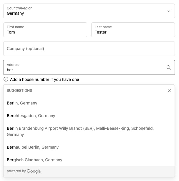
To ensure this feature is enabled in your store, go to store admin > Settings > Checkout > Address collection preferences and see if Use address autocompletion is checked. Unfortunately, this feature is not available in all countries (note the table may be outdated).
The single-page checkout has only one goal – successfully leading the customer to finish the transaction. Anything distracting may endanger this goal and potentially decrease the conversion rate.
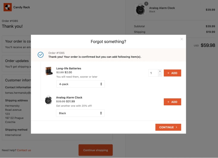
That's why I recommend not doing any upsell/cross-selling here but rather putting it afterward. On the post-purchase page, in the order confirmation e-mail, etc. They are also very effective and don't create a risk of losing the customer.
Last but not least, Shopify still allows you to switch to the "old" three-page checkout. Although the one-page checkout performed better during our testing, it doesn't mean it's the best choice for your segment.
Multi-page checkout can actually be better in high-AOV segments like furniture, electronics, auto parts, etc., where customers spend a lot of money. Similarly, in countries like Germany or Japan, where customers need more reassurance to finish the transaction.
Unfortunately, running a proper A/B test between the one-page and three-page checkout is impossible. Probably the easiest way is to monitor one layout for a month and then switch to another. Use the "Online store conversion over time" report to compare the performance and see if there is any significant difference. If not, choose the layout you like better.
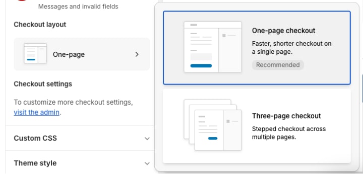
To change the layout of your checkout go to your store admin > Sales channels > Online store > Customize > Theme settings > Checkout and scroll down to "Checkout layout".
Conclusion: What's the "good" checkout conversion rate?
All these tips are rather minor optimizations, but all together can significantly uplift your checkout conversion rate.
How can you tell whether your checkout is converting fine or there is room for improvement? That's a tough question, and every business converts differently.
According to the Baymard Institute, one of the most respected UX research organizations in e-commerce, the current average checkout drop-off rate is 69% (which represents a checkout conversion rate of 31%). So, your goal should be to get better than the average. We regularly see solid Shopify stores achieving a conversion rate of 60%+ (i.e., a drop-off rate lower than 40%).
.jpg)